.
Time, and time to be present in our everyday life is a challenge for everyone. We want more time. Time to relax. Time to spend with our loved ones. Time to exercise. Time in nature, time to feel our hair in the wind and sun on our faces.
Alto natural supplements supercharges your time—whether you want more exercise, more sleep or more serenity—so you have more time to be you.

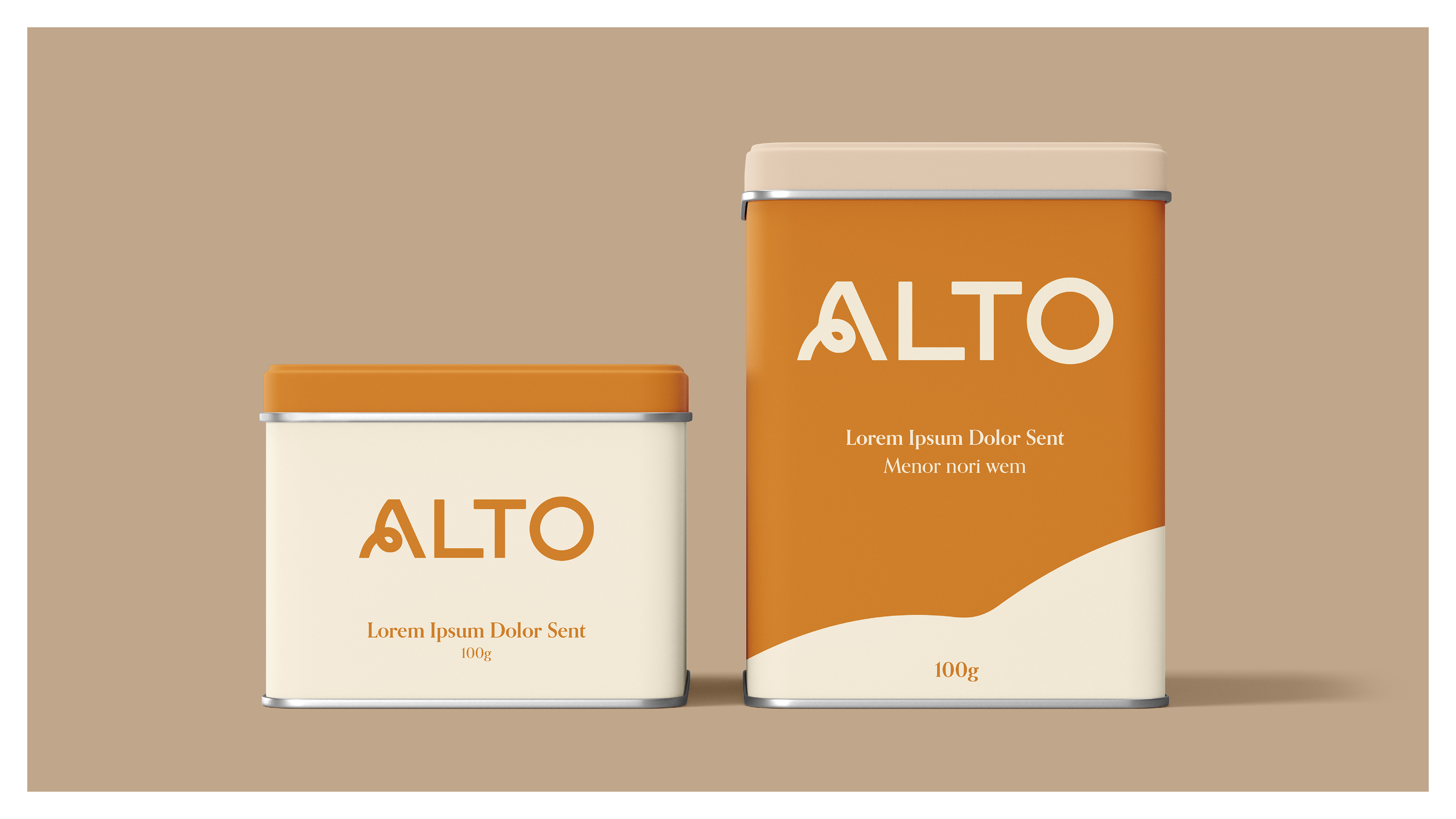
While the Alto product is focused on supercharging your time, it was important the visual identity explored new territories for what an energy supplement could be. For so long we have come to expect a product promising energy to be aggressive, often deafening in how it is advertised to the general public.
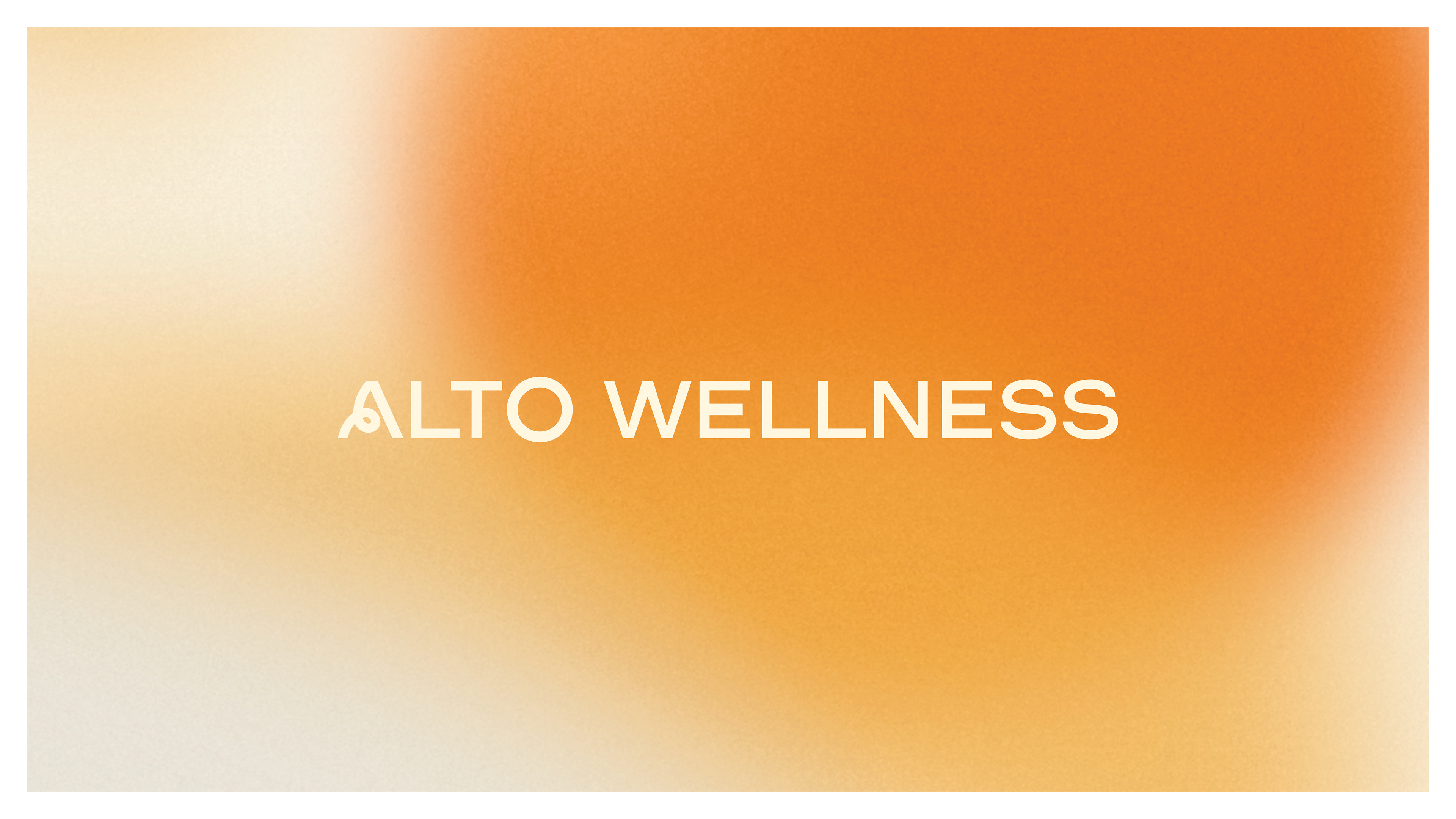
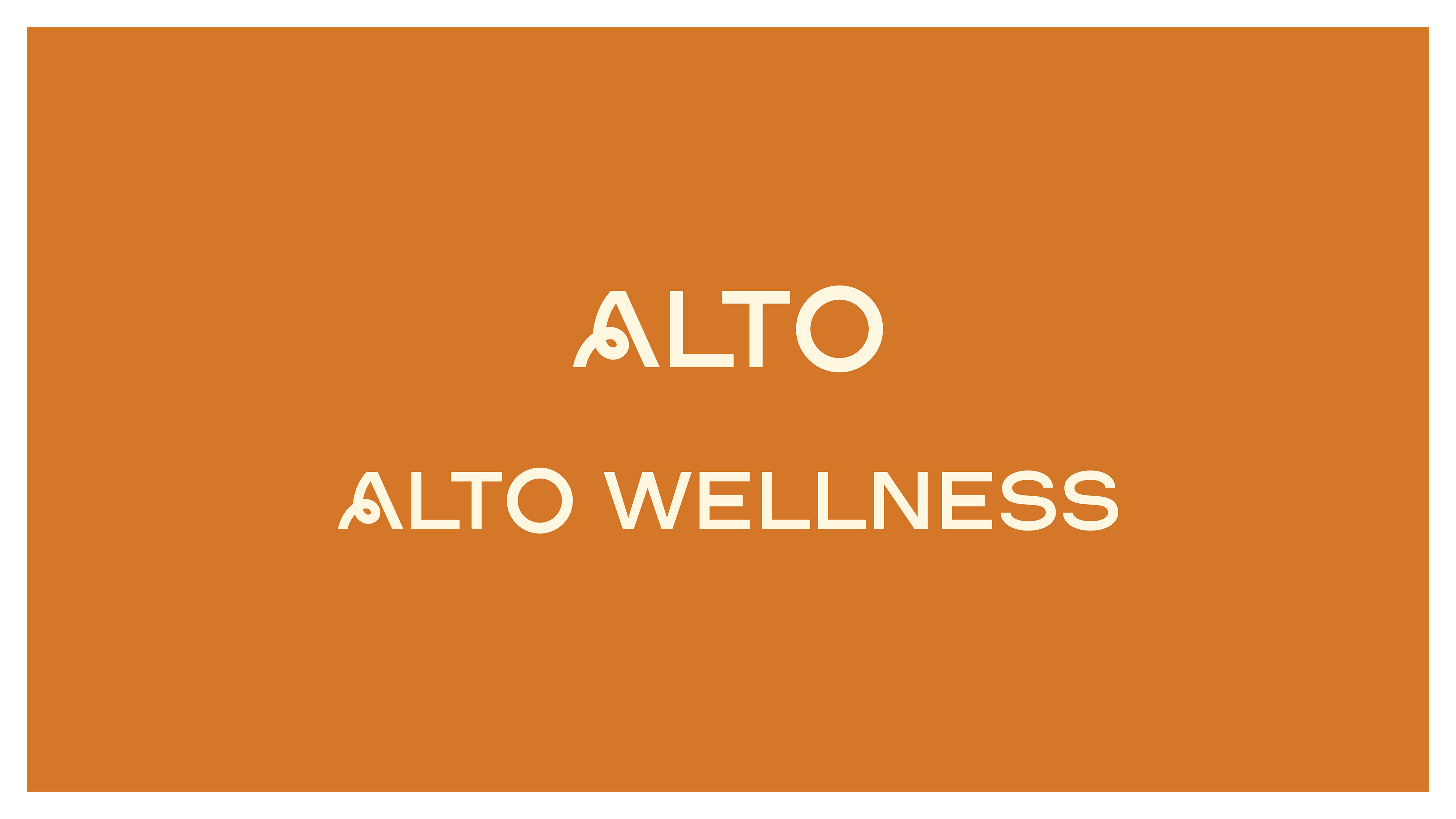
Alto sheds many of these standard expectations and channels power in a way that feels optimistic, full of life, and positive. The unique characteristic of the Alto 'A' is a somersault of energy built right into the logo. It bends proudly and is never afraid to stand out or take up space.
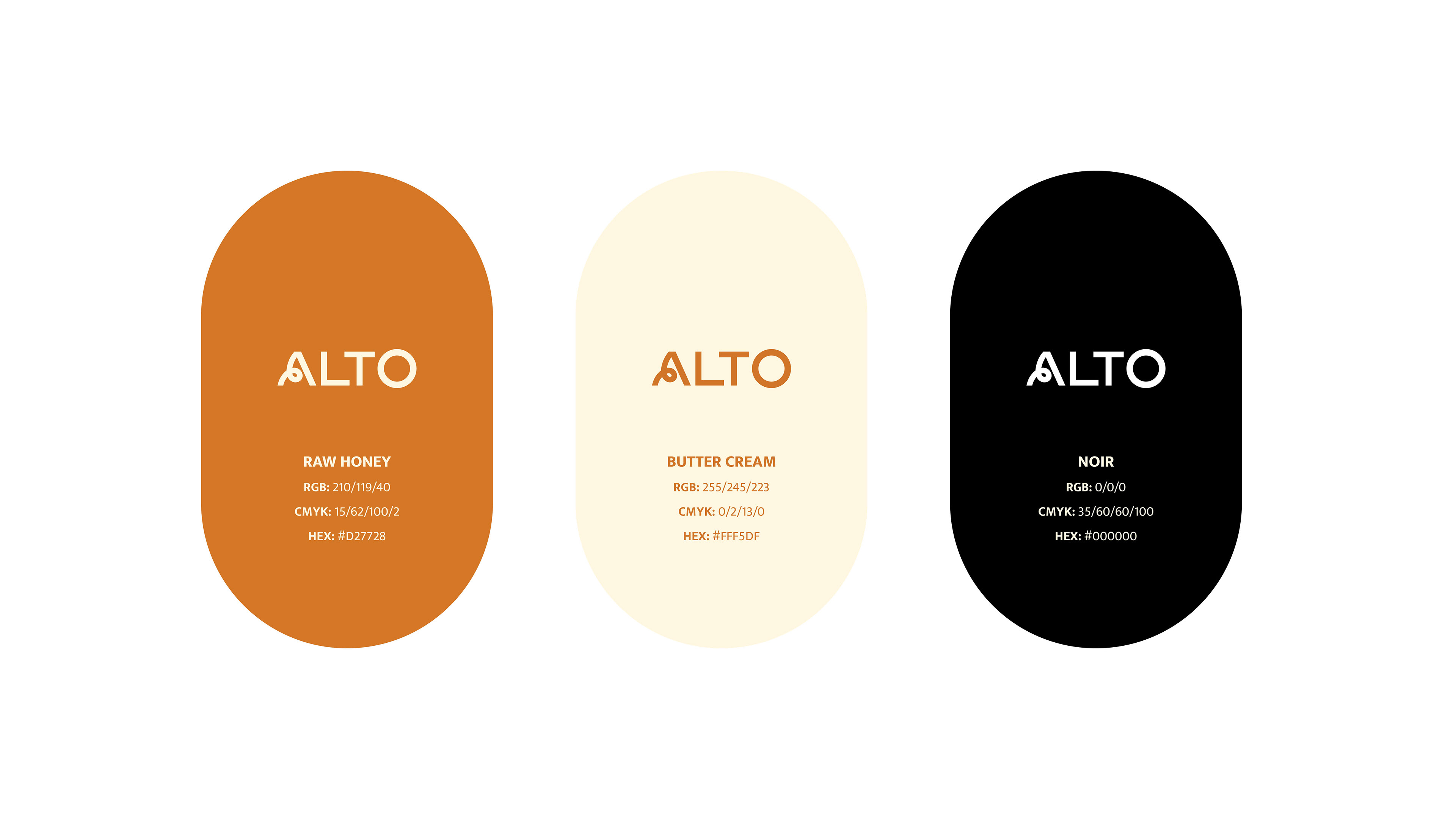
A colour palette that is warm, inviting and gender neutral further separates Alto from its competitors and was an important consideration from the beginning.

Poetic and personal copy language aids in removing barriers or preconceived notions for consumers who may have never considered a natural energy supplement for their everyday.
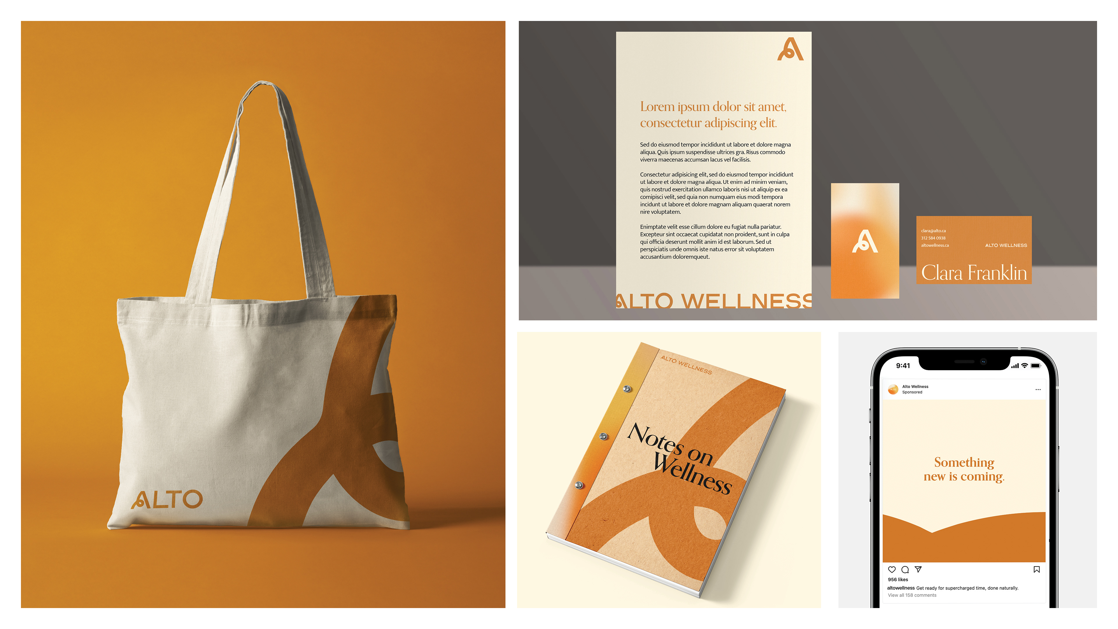
Branded collateral pieces feel flexible and fluid. The 'A' of Alto can be expanded and played with to craft a variety of different layouts and graphic treatments. A calm but dynamic balance of design was important to strike.